Research for location based game

For our game we had to do some research on already existing games so we didn’t make an already existing game. The two most popular games we found were Ingress and Geo caching.

Ingress is a game where you are an agent and you have to pick between two sides, evil or good. Once you have done this you give yourself a code name and then it will come up with a map that shows you where you are and follows you location. Around your area it will show hot spots, like important buildings, and show them as portals, which you have to hack and take control of and try to keep it so the other team can’t get it, the more portals you take over the better your team is.

Geo-caching is an activity or pastime in which an item, or a container holding a number of items, is hidden at a particular location for GPS users to find by means of coordinates posted on the Internet. Geo-caching is a real-world, outdoor treasure hunting game using GPS-enabled devices. Participants navigate to a specific set of GPS coordinates and then attempt to find the geocache (container) hidden at that location. In terms of gaming Geo-caching has impacted the gaming genre greatly. This is the king of smartphone games. Gamers have hidden close to a million caches around the world and posted clues and coordinates for each of them at Geocachin. com. Some are lunchboxes or ammunition tins filled with treasure and trinkets.
Colour scheme for our Location Based Game

For our Location Based Game we had to come up with a colour scheme that would work well together, we had decided we would used two different colors for our opposing teams then come up with the symbols for each team after which you can find here.

The Colours we toyed around with where pinks and blues before finally settling on a harsh purple and an a lighter teal, we used an adobe colour wheel to create two contrasting colours from the colour spectrum. The contrasting tool was extremely helpful in giving us a variety of shades to play around with in the logo creation process. We picked these colours for a variety of reasons, there bright and appealing to the eye, they also take on a fantastic colour form with a neon theme. The colours are recognizable and easily distinguishable from each other to avoid confusion, this was done on purpose as we took them from opposite sides of the spectrum. We choose purple for the rouges and teal for the agents as we felt with the purple being darker and teal being lighter it gives a light and dark contrast correlating with a good and evil presence

Symbols for our Location Based Game

For our location based game we came up with the story that their are two opposing teams and you will get to pick which team you want to be on. One of the teams is called the Agents, these are the good guys who’s HQ will be our college campus trying to stop the opposing team, and the Rouges who are people that are going undercover and trying to hack into the college for their own personal gain.

We first picked out a colour scheme for our opposing teams that would work well together, for this we chose purple for the rouges and a light teal for the agents, you can find out why we chose those colors here.

image

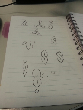
A few symbol idea’s

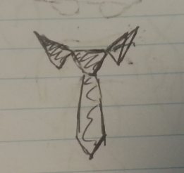
We then had to think of a symbol that was easy to recognize and remember for each side of the team. To do this we first done some research into agent logos, we had found out that a lot of the agent logo’s were made up of straight lines and shapes, we also looked up logo’s for evil organization and found that they used more free flowing lines, or animals for their symbol, for example a snake. After this we sketched up a few idea’s on what to have our symbols to be, we toyed with the idea of having animals represent each of our teams and also mythical creatures but then thought that it didn’t really suit the theme we were going for so we came up with the symbol of a tie and colour for our agents which consisted of all straight lines and shapes, giving it a smart and appealing look to it and for the rouges we came up with the idea of a hood with a scarf that colored the nose and mouth since this was the team that were to keep their identity hidden and also gave a bit of an evil theme to it.

image

Symbol for the Agents

image

Symbol for the Rouges